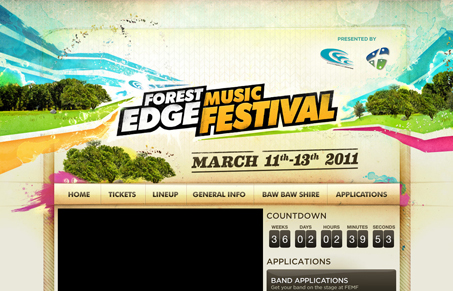
That background is intense! I really enjoyed looking at that and the matching footer area. I like how they worked one of the logos into the header – I’m still looking for the other one… It’s looks like they had a lot of fun making these graphics which are very interesting with all the elements/textures involved. I wonder if this large header graphic weakens a good real estate area though.
So far the information they have is well organized and clean. It will be interesting to see how they present their lineup and accommodation information once they get it up.
I’m a little lost on the homepage because there is no introductory information telling me what kind of festival this is and where. It would also help to have a preview up where the video is because it’s just black for me 🙁


0 Comments