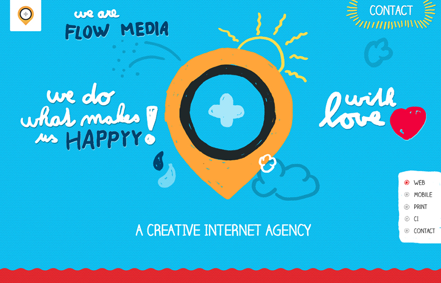
The mixture of the long scrolling page and the screen clearing visual effect when you click on the nav item gives the site the feel that it’s not just a long form scroller. I’m not 100% sure if that’s good or bad. Nice responsive solution too.


The Call to Action, Revisited
The Call to Action hasn’t changed in a decade, but the bar has. A fresh look at prominence, copy, mobile tap targets, and accessibility, with lessons from three major design systems.


0 Comments