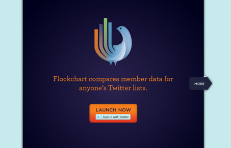
Really nice branding here. I love the colors and that logo. I like how the main page for this site is a simple slideshow like a standard presentation then a login with twitter button. Really simple and matches the app nicely.
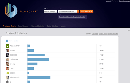
Then there’s the app screen itself:
The main purpose is to analyze one of your lists. It’s organized visually quite nicely and you can see at a glance down the page how everyone in your list is doing and what impact they have. I really like the twitter join date display towards the bottom, that’s really smart looking.


0 Comments