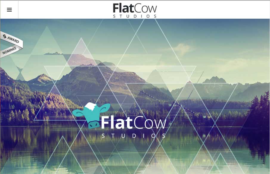
I’m not sure if the name Flat Cow is a play on an oxymoron, but design-wise, I like the contrast between the flat design, coupled with robust design – it plays well on this site. Also, the full-width design on the Work page is also pretty cool – and like the different use of a slideshow on the Contact page.
Glassmorphism: The Transparent Design Trend That Refuses to Fade
Glassmorphism brings transparency, depth, and light back into modern UI. Learn how this “frosted glass” design trend enhances hierarchy, focus, and atmosphere, plus how to implement it in CSS responsibly.


0 Comments