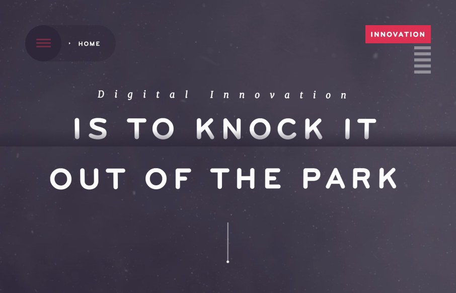
There is so much going on with the Fixed Group website that it just makes me smile. It’s a fairly simple look and feel but all the interaction and nav design leaves you really blown away. I really dig the main nav interactions a great deal. The colors and dark/muted elements give it a moody feel but it’s overlaid with some fun copy and photography.


The Call to Action, Revisited
The Call to Action hasn’t changed in a decade, but the bar has. A fresh look at prominence, copy, mobile tap targets, and accessibility, with lessons from three major design systems.


0 Comments