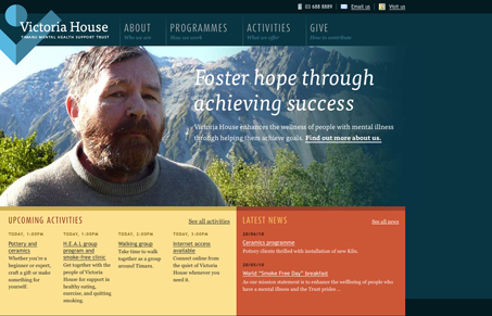
I really love the overall look and feel of this design, the colors are perfect and the typography is very tight. I love the transition between the home page design and sub page design.
I may be mistaken, I think I saw that this site was done as part of a 24 hour type of non-profit service project. If anyone can enlighten m on that please do!


Yup, that was from FullCodePress (24 hour event) not too long ago = http://jasonsantamaria.com/articles/fullcodepress-2010/
Great work with such a crazy schedule.
You are correct. It was completed as part of the FullCodePress marathon project by team USA. Also agree with the tight typography and layout. Overall well done, especially considering the timeframe.
None other than Jason Santa Maria and a team at a Webstock event.
AH HA! I knew i’d seen that, just couldn’t put the “full code press” together with the site name. Thanks guys, truly truly great work for 24 hours!