
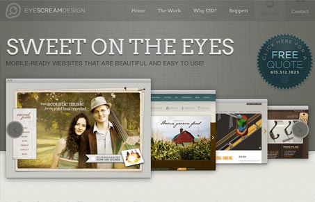
There’s a good deal of coolness going on with this website design. I love the slideshow interactions and the work done on the “read more” links under each of the three marquees at the bottom are just so clever it makes me mad. The most beautiful part is the responsive approach and the animations that occur on screen resize to make it feel fluid. Lovely website!




Just lovely! I really like the color scheme – very easy on the eyes and classy. The resizing is just awesome. Great job!