evaneckard.com

evaneckardcom

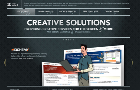
I really dig the background pattern and the gradient/light shift. The colors give it a nice cool feel too. This guy makes some nice themes too, including that “Desktop Chaos” theme from the Smashing Magazine giveaway.

I’m not too hip on the small script type font used under the main navigation links. It’s fairly hard to read. Over all though, this design is well done and I like it.

2 Comments

  1. Joe

    this is fantastic, I love the color scheme. It screams modern web design. Web designers take notes.

    Reply
  2. Julia

    Just a quick comment – it bothers me so much that there is no space between “view more projects” and the double arrow. It’s the little things..

    I also agree with Gene on that script font in the nav. It’s almost out of place.

    Reply

Leave a Reply to Joe Cancel reply

Your email address will not be published. Required fields are marked *

News & Articles

Sign-Up: Enhancing Conversions through good UX

Sign-Up: Enhancing Conversions through good UX

Optimize your website’s sign-up process by focusing on clarity, ease, and user mindset. Clearly explain the purpose, benefits, and steps, and use social proof to build trust and drive conversions.

The Essential Guide to Getting Started on Freelance Writing

The Essential Guide to Getting Started on Freelance Writing

Explore the lucrative and fulfilling world of freelance writing with our essential guide. Learn about specialties like blogging, social media, article, and technical writing. Build a portfolio, find work, set up your business, and discover the potential earnings. Embrace the freedom of working from home and follow tips for success in your dream career.