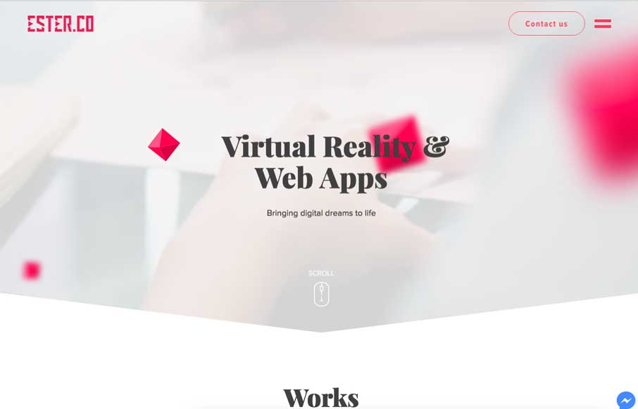
I like the way the design starts out sort of minimal and get’s more and more visually dense as you scroll down the page. The case study marquis are pretty well done and I love the contrast to the rest of the site here. The illustration work is good too.


The Call to Action, Revisited
The Call to Action hasn’t changed in a decade, but the bar has. A fresh look at prominence, copy, mobile tap targets, and accessibility, with lessons from three major design systems.


0 Comments