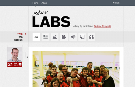
Blog design for Erskine Design. It’s very Tumbler-like in it’s basic orientation, with the media like segmentation of content. It’s beautifully designed and executed too. I love how the header nav bar and content type icons slide up together to cover over the logo then stay fixed in place, very cool. The overall color scheme really makes the images for the content stand out strong. Great looking blog design for sure!


0 Comments