Submitted by Jeremy Mansfield, @brandaiddesign. Designer & Developer.
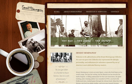
With the Hemingway site, we wanted the viewer to feel like they were getting a top-down view of a Hemingway writing desk, and staring at his journal. This opened itself up to some fun and creative Photoshop layout executions. We weren’t concerned with “how are we going to program this”. We just knew we’d figure out a way. And that “way” ended up being the muscle behind .PNG transparencies, absolute positioning and z-indexing.
There’s something about this design that I like, it took me a while to really put my finger on it and I realize now it’s the warm tone to the palette. The wood background and other colors chosen really sell the idea of Hemingway (at least the idea of him that I have in my head.) One thing about this design that may not be working for it so well is the concept, I took me several viewings to fully grasp what the site is ‘about’. Overall I think this is a well executed design with some nice real world imagery burned into it. Good stuff.


This is a really nice looking site. The textures and the depth of all the real elements add to a really tactile-like experience. It also took me a bit to figure out what it was about too, I feel like it would come off better if it was more upfront in it’s purpose. If there’s nothing unseemly about selling stuff under Hemingway’s name, then why obscure it?
My main problem with this site is in the optimization, or lack thereof, of the images. Transparent .png images do allow for you ‘muscle’ a design that may be hard to do otherwise, but part of coding and delivering a site is to do it in a way that is efficient as possible. The passport image on the home page clocks in at 533kb, and the whole home page comes in at about 1.7mb. That’s just too large for a site like this. I have a fast connection and I even noticed that these images are loading slow, so imagine someone’s experience on a somewhat slower connection.
I think it’s very important in the creative process to not think “how are we going to program this”, but when it is time to code it, how to balance design with the execution is very crucial. People often only spend matters of seconds on home pages before moving on, so making them wait for a number of unnecessarily large images to load only makes it more likely for them to leave without taking in any of the content.