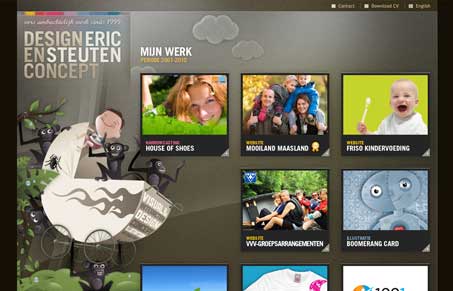
Interesting layout, it comes off looking really static somehow, maybe it’s the illustrations that ground it in place… I do like this site, very strong illustrations and clearly being a portfolio you can just dive right into looking through the work. I’m not hip on the justified text on the left sidebar but I can see where one would really want the grid to be tight though.
Glassmorphism: The Transparent Design Trend That Refuses to Fade
Glassmorphism brings transparency, depth, and light back into modern UI. Learn how this “frosted glass” design trend enhances hierarchy, focus, and atmosphere, plus how to implement it in CSS responsibly.


I think the design wouldn’t have worked without the perfect balance between the crazy background visual and the almost Swiss grid holding everything in place. Very easy to scan without getting dull… well done!
The illustration does it for me too. Monkeys and a baby buggy, silliness…