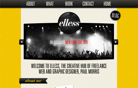
Really strong yellow color with some nifty texture going on at the same time. I like the fixed header/nav design here too. There are some nice design details here too, like the treatment around the logotype and the other banner like flourishes here and there.


0 Comments