
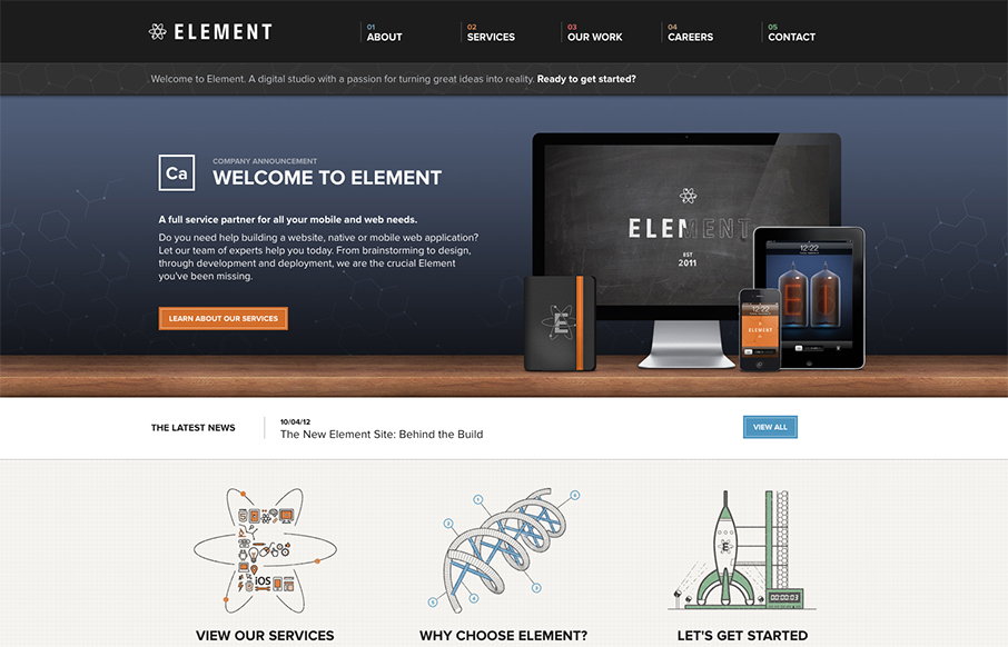
Element has just launched a really well done site. It has all the fancy bells and whistles of a hero carousel, responsive design, and snazzy graphics. What I really appreciate though is how overall what they’ve done is create a mature and solid brand experience. To me, the call to action here is less about the quick sell, and more about the discovery. I get the sense that every detail was poured over and that directly reflects how they’ll help those ‘happy clients achieve global domination.’


Fitts’s Law: Why the Easy Button Wins
Large, close targets are faster to hit than small, distant ones, that’s Fitts’s Law. A look at the 1954 rule behind buttons, prime and magic pixels, thumb zones, and dark patterns.


I completely agree with you Maria regarding all of the little details Element put into their redesign that puts a strong work quality to their brand. My favorite thing about this new design would have to be their fun retro-nuclear illustrations.