Electric Pulp

http://electricpulp.com/

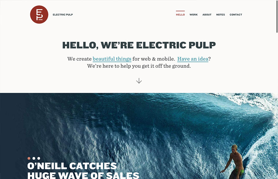
I’m always a fan of Electric Pulp’s work, their company website designs have always delivered as well. Often being copied outright – which you know what they say about imitation and flattery…

This site design follows a trend of simplifying the overall design. At first it looks like it’s a big single page site but they’ve incorporated a good bit of content about their team and their work – all really good stuff.

I was also super pumped to see that they’re using fonts from the new(ish) Hoefler & Frere-Jones font service on here. Very cool.

0 Comments

Submit a Comment

Your email address will not be published. Required fields are marked *

News & Articles

Sign-Up: Enhancing Conversions through good UX

Sign-Up: Enhancing Conversions through good UX

Optimize your website’s sign-up process by focusing on clarity, ease, and user mindset. Clearly explain the purpose, benefits, and steps, and use social proof to build trust and drive conversions.

The Essential Guide to Getting Started on Freelance Writing

The Essential Guide to Getting Started on Freelance Writing

Explore the lucrative and fulfilling world of freelance writing with our essential guide. Learn about specialties like blogging, social media, article, and technical writing. Build a portfolio, find work, set up your business, and discover the potential earnings. Embrace the freedom of working from home and follow tips for success in your dream career.