Submitted by Gio Ledda, Designer.
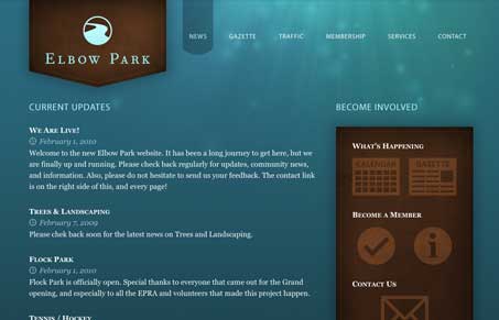
I like the shapes that the logo an right hand sidbar elements are placed on, it’s a nice contrast to the background (almost underwater feel?). The large icons for the calendar and gazette and stuff are also nicely done.


Here’s my problem. Can you go to this site and tell me what it’s about? I’m assuming it’s some sort of update site for a housing community, but really I have no clue.
Looks like you figured it out then… I don’t think all sites have to be for the general public, like here, if it’s for a neighbourhood community then the people that live there will know exactly what it’s for.