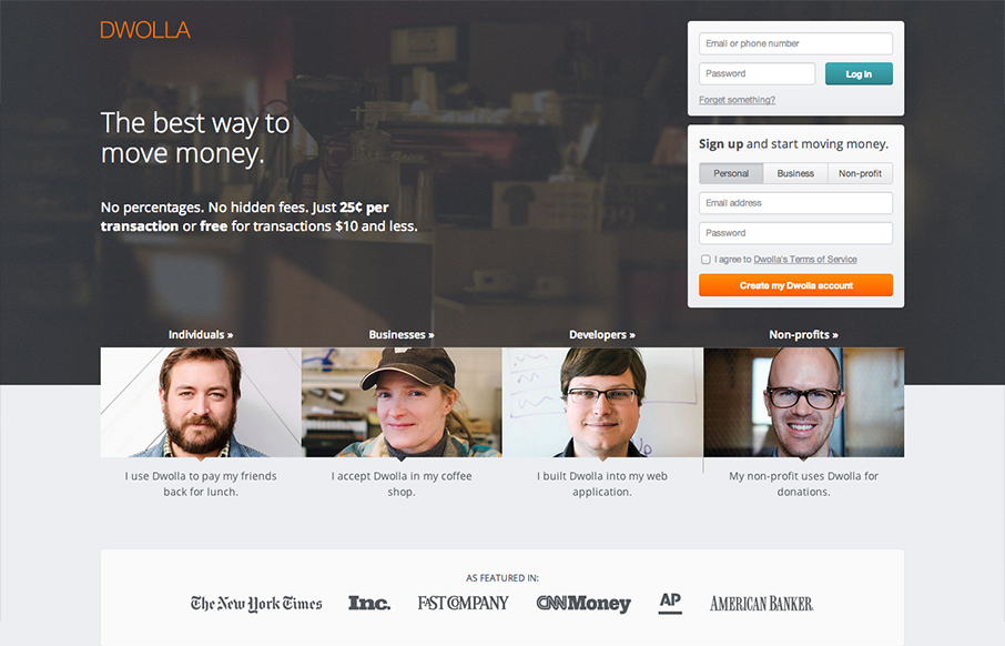
The Dwolla site design is of good quality and execution. I like the different configuration and stacking of the elements on the page as you scale the page down to smaller screen widths. What I like most of all is the use of negative space between the main/topmost copy and the signup boxes. The text almost acts like an arrow pointing towards the calls to action. Then as you scale the page down to the mobile screen width targets the call to action shifts to downloading the app on your device. Beautifully executed strategic decisions.


The Call to Action, Revisited
The Call to Action hasn’t changed in a decade, but the bar has. A fresh look at prominence, copy, mobile tap targets, and accessibility, with lessons from three major design systems.


0 Comments