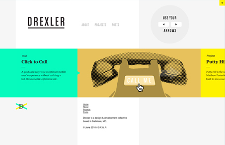
There are some really good things happening in this site design. First I love the minimal aspect to the home page, presenting the blog posts in a slideshow/side scrolling setup like this works great. Second, I love the bright colors and illustrative quality to the imagery used on the page. I don’t know about interactions that you have to explain visually though, I love the fact you can use your arrow keys to slide the posts left and right, but maybe resist the need to show me visually, just me thinking out loud – would love to hear what you all think about that aspect of the design.The sub pages are are as nice as the home page, just greatly expanded visually.

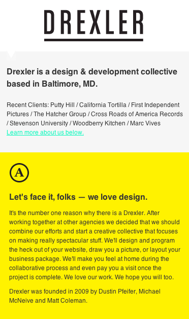
There is an iPhone version of the site too, its a simplified, single page, version of the site but I really like it too.


0 Comments