
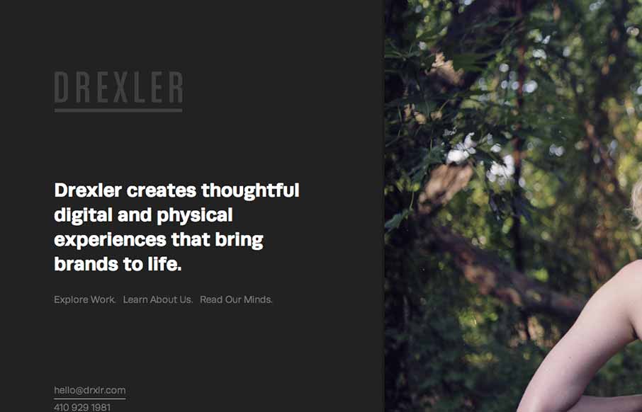
The Drexler website is both minimal and highly interactive. There’s plenty of javascript here for everyone but it’s not overly distracting. Things move around smoothly and it’s still fairly easy to generate a good mental picture of what’s going to go on each page as you click around. I really like how the work section comes together, with the scroll being focused on the column to the left and then opening up to a full page view when you click on each portfolio entry.


Fitts’s Law: Why the Easy Button Wins
Large, close targets are faster to hit than small, distant ones, that’s Fitts’s Law. A look at the 1954 rule behind buttons, prime and magic pixels, thumb zones, and dark patterns.


0 Comments