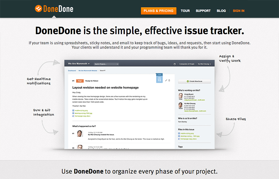
Great scrolling product home page. I like how it tells the in’s and out’s of how the app works quickly and succinctly, there’s even a little sub-nav thing that pops out as you get through a good bit of it. It’s responsive too and interesting to study how the extra screenshot notes and arrows fold up and away as you get to view it on the smaller screen widths.


The Call to Action, Revisited
The Call to Action hasn’t changed in a decade, but the bar has. A fresh look at prominence, copy, mobile tap targets, and accessibility, with lessons from three major design systems.


0 Comments