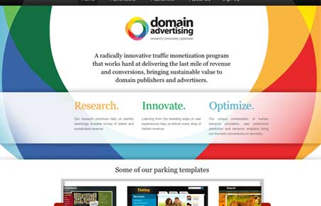
I really love the giant over sized background/pattern that matches the logo. It’s really unique and reminds me of a bulls-eye which is smart given their services center around marketing. About that, it took several readings to figure out what exactly this site was selling, I think the copy could use less marketing speak and lay it out for me in a more simple manner. Overall though, the site looks pretty good and I really love the sub page design, particularly the sub navigation..
Glassmorphism: The Transparent Design Trend That Refuses to Fade
Glassmorphism brings transparency, depth, and light back into modern UI. Learn how this “frosted glass” design trend enhances hierarchy, focus, and atmosphere, plus how to implement it in CSS responsibly.


lovin the bright colors.
I think they hit their target if they confused you. I mean, that’s their business, placing confusing placeholder pages full of advertising on parked domains so unwitting visitors who possibly mistyped a domain won’t realize it and click away.
Touche John. I think that main paragraph of text under the logo is prime space and the copy there should speak more clearly about the service.