
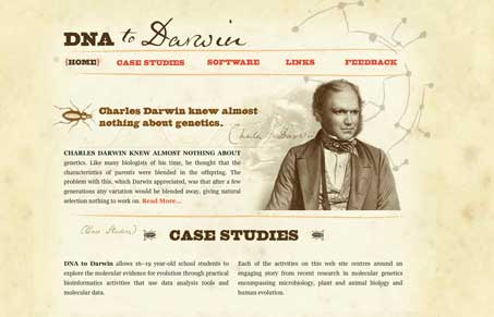
Pretty straight-forward design. I like the way it harkens back to a time that dates with the main illustration/portrait of Darwin. They type supports this and is fun at the same time. The illustrations are all very nice and fitting as well as the coloring chosen. It all blends well to set the tone for the content.




This is great. I love the overall look and feel.