
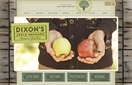
Really nice tactile feel to this design. Mainly the details make this site so nice, the wood background selling the apple crate feel and the typography and lines make me think of hand made labels. All very earthy feeling colors and textures without being too early – a little L.L. Bean feeling. It’s a nicely designed website and really sells the brand imho.




0 Comments