Divide by Two

http://dividebytwo.pt/

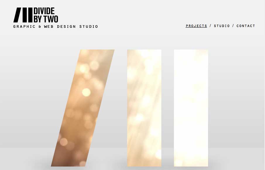
Nice simple layout. I like the logo treatment in the hero image space with the animation/video in the background of the letter forms. Nice touch there.

Submitted by: Joana Carvalho
Role: Designer & Developer

This is my own studio’s website. We tried to create a simple, clean layout that’s great for showcasing our work. Some updates are to be implemented soon.

0 Comments

Submit a Comment

Your email address will not be published. Required fields are marked *

News & Articles

Sign-Up: Enhancing Conversions through good UX

Sign-Up: Enhancing Conversions through good UX

Optimize your website’s sign-up process by focusing on clarity, ease, and user mindset. Clearly explain the purpose, benefits, and steps, and use social proof to build trust and drive conversions.

The Essential Guide to Getting Started on Freelance Writing

The Essential Guide to Getting Started on Freelance Writing

Explore the lucrative and fulfilling world of freelance writing with our essential guide. Learn about specialties like blogging, social media, article, and technical writing. Build a portfolio, find work, set up your business, and discover the potential earnings. Embrace the freedom of working from home and follow tips for success in your dream career.