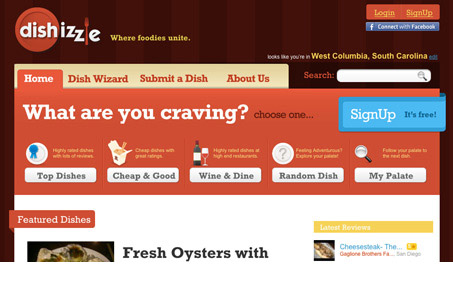
There’s some really great stuff happening on this web app design. First off I love the colors and illustrations/icons. The colors seem really well thought out, with the calls to action really clean and clear and colored in kind. The type is bold and gives the site a really strong graphic appeal as they match in-line well with the icon work.
There is some weirdness here and there within the app, like for example when you click the “dish wizard” you are presented with a half empty page, some of the sub pages do this too.
All in all I really enjoyed going through this site, spend some time on it and look over it, there are some clever things design wise happening here.


0 Comments