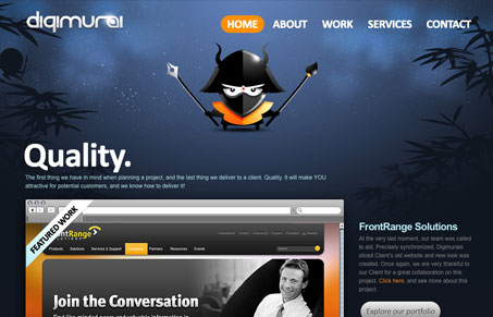
I like the “theme” aspects to this design, the naming and the samurai angle worked throughout in the background and especially in the logo are clever. The layout of the home page is very clean feeling even though the background and illustrative logo are on there in such a large header space. The big bold buttons for all the call-to-action spots stand out really well. I think the portfolio navigation falls apart within the design a bit, the big squared iPhone looking icons detract from the rest of the site a bit.
Glassmorphism: The Transparent Design Trend That Refuses to Fade
Glassmorphism brings transparency, depth, and light back into modern UI. Learn how this “frosted glass” design trend enhances hierarchy, focus, and atmosphere, plus how to implement it in CSS responsibly.


0 Comments