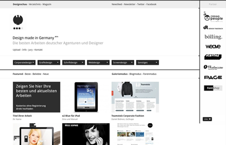
Very stark, black and white design. I like the minimalism in regards to the palette. It really lends you to notice the grid behind the design and see that it’s well followed. I like how the sponsor logos are handled in the right sidebar too. When you mouse over one the others fade out, that’s a nice touch.
I will say that I’m on the fence on the infinite scrolling, I like it when galleries have that but sometimes it’s something i’d like to turn off. How do you guys feel about the infinite scrolling action here and/or in general?


I love black / white themed sites. They always look so cool, especially when it is based on such a solid grid layout as this one is. I agree, the opacity change upon rollover is a nice, subtle touch to really enhance usability.
As for the infinite scroll.. mmm I too am on the fence. It works really well in mobile devices (reddit app), but on a full-on site? I’m just not sure. I like the feature, but I can never really navigate back to a thumbnail I saw 5 infinite scrolls ago.
Yeah, the infinite scrolling is a real issue that I can’t decide on. Sometimes it’s cool, like you said. Then mostly I don’t like it because I have no idea how much stuff is going to be on the page. I like the browser scroll bar to be my indicator of how much content i’m about to take in…