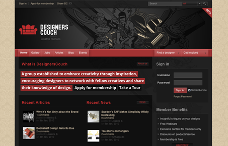
Pretty neat looking designer network. I like the overall dark design with the contrast of the light background, that’s an interesting pair. The grid in this design is rigorously followed and makes for a really tight looking site. The red color used here isn’t too bright and it’s not too dull, it’s perfectly matched to go with the black.
Glassmorphism: The Transparent Design Trend That Refuses to Fade
Glassmorphism brings transparency, depth, and light back into modern UI. Learn how this “frosted glass” design trend enhances hierarchy, focus, and atmosphere, plus how to implement it in CSS responsibly.


0 Comments