
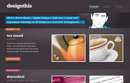
Design-This is The online Portfolio of Kevin Bryan. I loved coming across this submission. It’s only like a 3 page site but it feels a lot deeper, probably due to the way it’s all presented. The sub pages are treated like individual landing pages in their design/presentation. It has clearly been thoroughly thought out and very well executed. The illustrations are very nice and the coloring and typography are top-notch. Seeing a site like this makes me want to rework my own portfolio site…




0 Comments