
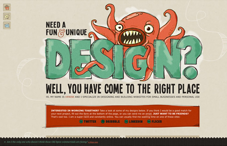
denisechandler.com is all about personality. The illustrative graphic header, the hand drawn boxes and the animated hover-states create an incredibly active and energetic site. The structure of denisechandler.com is somewhat simplistic but provides a rock solid platform upon which she can hang her considerable talents and personality. The non-traditional orange and green palette works well; it reinforces her claim of being fun and unique as well as displays her ability to handle color. I think that the illustrations are so approachable because they toe that indistinct line between children’s art (some of my favorite art in the world can be found in children’s books, by the way) and smart and snappy design. Chandler has a real sensitivity for combining sharp design and playful imagery.




0 Comments