Submitted by: Simon Foster @simonstretch
Role: Designer & Developer
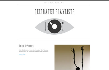
Decorated Playlists is a simple concept site. Basically, Simon makes a playlist on a certain theme, then designs a sort of ‘poster’ around each theme. The designs are simple, usually with a bit of noisy texture, and quite nice. As well designed as they are, this seems like a perfect type of site to try and push some CSS techniques with. I would love to see attempts made on a few of them to achieve the same effect with CSS. I could see a design like the Run for Cover one possibly achievable with css transforms.


Hi Jay, thanks for putting my site up on your site 🙂
I take your point about doing more with CSS, I originally intended to do a lot more with some snazzy CSS techniques but then decided to reign it in a bit as it felt like I was doing them “just for the sake of it”. The playlist designs are deliberately very simple in their conception so the music isn’t smothered by too much design or complicated code. Although there are some nice little subtle CSS3 details scattered about (if you use webkit), but only where it enhanced the overall design 🙂
Thanks again, for putting me on your site, I’m a big fan of you guys
Simon