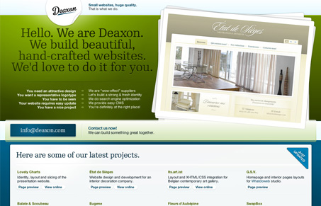
This is a really different look at a web-design company website. I like their approach with the copy and the design, very refreshing design.
This is a really different look at a web-design company website. I like their approach with the copy and the design, very refreshing design.


Glassmorphism brings transparency, depth, and light back into modern UI. Learn how this “frosted glass” design trend enhances hierarchy, focus, and atmosphere, plus how to implement it in CSS responsibly.

Brutalism in web design rejects perfection for authenticity. Stark grids, raw type, and honest structure create interfaces that feel human, intentional, and impossible to ignore. Break the rules, on purpose.

Monochrome Minimalism merges Bauhaus discipline with IKEA simplicity. Clean grids, muted tones, and functional beauty create digital calm, proof that restraint, not decoration, defines timeless design.
It is a nice looking site. I like how they’ve used a PNG overlay for their highlights while using a repeating background to setup the layout. I havent used such a large overlay because it doesnt scale up well, but it’s neat seeing the different ways people are using PNGs in their designs. Though, their site does load pretty slowly. I wonder if it’s because of all the PNGs or the traffic theyre getting from being featured on design galleries like Unmatched.
Speaking of transparent PNGs, have you seen; silverbackapp.com yet? Pretty darn slick…
Yup, seen their PNG use along with Mr. Hicks’ gorilla. Pretty slick indeed.