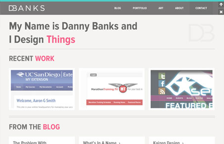
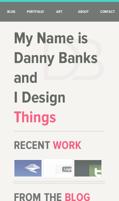
I really love the crisp grid layout and the hard yet soft edge to this design. Everything is a straight line/grid but it’s softened by slight blur and coloring. The header/nav also stands out to be and is a neat UX design. I think the design here is serious and i’d love it if the main tagline was treated with the same respect. I get it, trust me, but “I build things” would have so much more impact if it carried the same tone as the rest of this great design. Maybe i’m over thinking it though.
I do love this design, the clincher too is the responsive finish. Simply quality work here.


0 Comments