
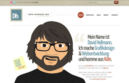
The thing I like most here is the size of the illustration, it plays into the scrolling nature of the browser quite well. It’s a little bit of an experience to scroll the thing down. When you do this, you come to the footer which is very nicely designed too. The website is very thoroughly designed and you can see the craftsmanship put into it quickly. I also very much love the contact us page.




0 Comments