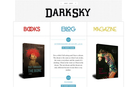
Darkskymagazine.com is a simple but highly functional site. Its pleasing symmetry is used to effectively create a separation of content. When you click on the three main links it feels less like moving to another page and more like some kind of jQuery tab transition. This helps to maintain a feeling of ‘groundedness’ (did I just coin a word?). You never feel like you are jumped to a new location, rather the content feels immediately available all the time. Honestly, I’m not too keen on the logo but it does work pretty well within the context of the site. Let us know what you think. Too simplistic? Just enough? What about the ‘tab style’ page variations?


0 Comments