
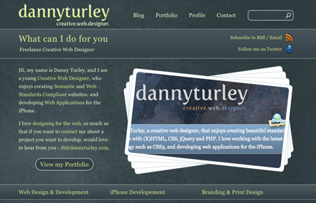
Portfolio website by Danny Turley. Overall it’s a pretty good looking website. If asked for art direction I would focus on the logo, specifically the logo typeface since I don’t feel like it jives with the rest of the site’s design. Other than that, it’s a pretty decent website design.


Fitts’s Law: Why the Easy Button Wins
Large, close targets are faster to hit than small, distant ones, that’s Fitts’s Law. A look at the 1954 rule behind buttons, prime and magic pixels, thumb zones, and dark patterns.


Thanks for featuring my site 🙂
Really appreciate the comments, the site is still a work in progress, and I hope to improve the logo once I have finished University.