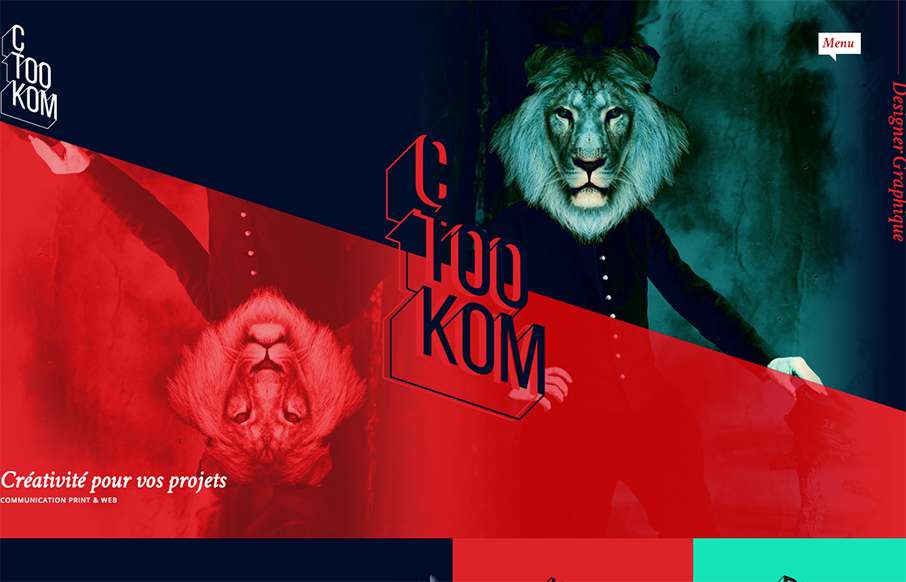
Man, this site blows me away visually. I love that logo/display type and the colors, man. I love the header and how it slides away from being a large hero area and keeps itself there in the fixed header, but still has that slight parallax slide vibe. Strong stuff.
From the Designer:
Graphiste webdesigner en freelance sur Toulouse. Création de vos supports print & digital.
Submitted by: Fleury Vincent
Role: Designer
Country: France


0 Comments