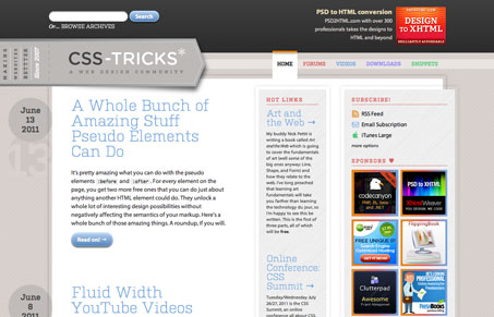
This is, I think version 9 or so, of Chris Coyier’s (@chriscoyier) CSS-Tricks.com website. We’ve reviewed his site designs in detail in the past and have always followed his progress and how he approaches working on his website. This one for me is a fine addition to the UMS gallery.
It’s pretty well tricked out with some CSS goodies, from the gradients in the link hover states to some of the interactions in the footer. Chris gives some good insight into the redesign right here.
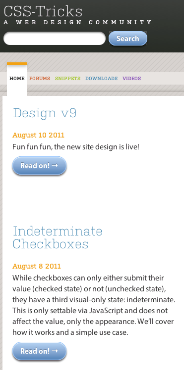
The thing I keyed in on is how the design is responsive, Chris gives a good breakdown of his approach as well:
The old design used media queries, but this one is closer to “responsive” because it’s also fluid, which means it’s probably going to do OK on lots of devices I didn’t even plan for. For example, I didn’t even test it on the iPad but I hear it’s alright. I also chucked some transitions on a few elements so when the media queries hit and change those values they animate to their new position/size. I used three weird-ish breakpoints. Default is for browsers above 1200px (most of my traffic), first break point is that. Then breaks again at 1024px and then at 860px (which is basically the mobile version).
The cool thing for me is that Chris is fearless in his redesigns, he loves to experiment and try new things – even entirely new designs. It’s fun to watch as it develops constantly.


0 Comments