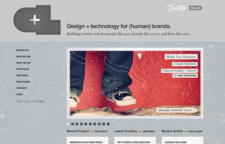
We recently featured Crushlovely.com in our design review podcasts and it needs to be cataloged in the gallery here as one of the web’s top-notch designs.
You can listen to the podcast for more detail. The short story is we loved it, we thought it was full of detail both visually and interactive wise, just the right mixtures to make it a great site.
The one thing I think is pretty awesome is that they used basic web safe fonts in the design, I for one think Helvetica and Georgia are really nice typefaces on their own. That’s pretty cool in this day of @font-face and cufon (those aren’t bad by any stretch) that the team at Crushlovely.com wanted to keep it simple.


0 Comments