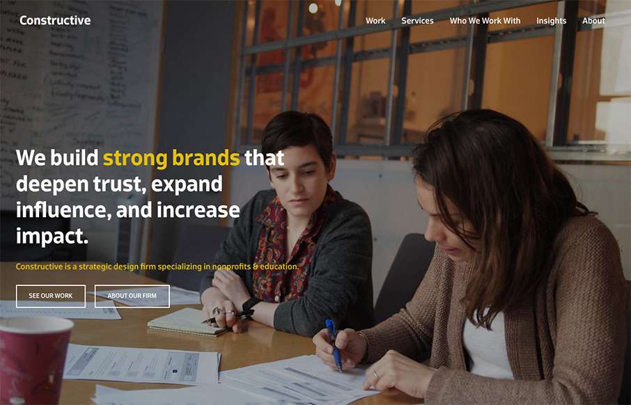
It’s a fairly standard approach to a layout but I dig it. I like the way the large splash image blends on top of the modular boxes below it. It feels fluid this way. Add in some decent responsive design and it makes for a great site.


The Call to Action, Revisited
The Call to Action hasn’t changed in a decade, but the bar has. A fresh look at prominence, copy, mobile tap targets, and accessibility, with lessons from three major design systems.


0 Comments