Found Via @elliotjaystocks
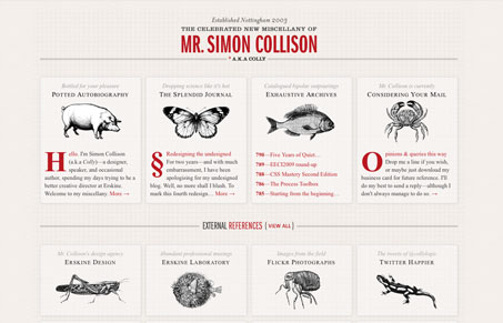
Beware: don’t visit @collylogic‘s new site because it’s so lovely it’ll make you want to give up design and kill yourself. http://colly.com
Simon Collison’s new personal website is a doozy. It’s a great example of something that I hope to see is part of a growing trend, sites with an obscene amount of attention put into small details. On first glance this design isn’t revolutionary (no offense Simon), it’s a multi-column layout with some illustrations and good typography, but oh my god, as you spend some time looking at it, the detail work just envelops you. It’s subtlety like this that makes me fall in love with web design all over again.
For further reading there’s a fairly exhaustive post here entitled “Redesigning the undesigned” that takes you through the design bit by bit.


I find it interesting that some of the best sites get lower ratings – and I think it because they always do something different! This is a great example of wowing someone with your creativity and attention to detail rather than the 1 in a million ego-boosting portfolio sites.
I don’t think I’ve ever seen footnotes on a site before, that was a neat detail find. I also loved the styling of the contact form. Everything here from the colors to typography seems to be understated brilliance!
This site certainly raises the bar on website design. The attention to detail impresses me each time I visit this site, because I keep finding new little things.
Colly’s website is awesome, so simple but very effective. I also love the fact its multi-column layout works across so many medias. He has really thought about what it looks like on different sized screens (iPhone – iPad – iMac) each version is different and cleverly thought about. GO COLLY!