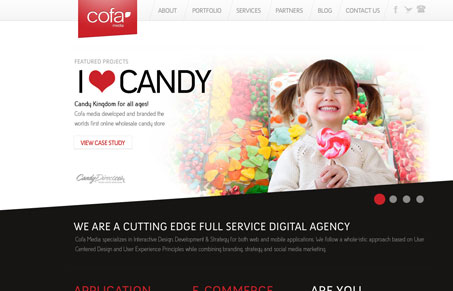
I like the strong diagonals used across the home page. I also really like all the interaction detail put into the main navigation. The mouse over for the contact (phone #) is really great. This site has really great feel and rhythm visually across almost all the pages, it just presents a very nice tone to me.
Glassmorphism: The Transparent Design Trend That Refuses to Fade
Glassmorphism brings transparency, depth, and light back into modern UI. Learn how this “frosted glass” design trend enhances hierarchy, focus, and atmosphere, plus how to implement it in CSS responsibly.


0 Comments