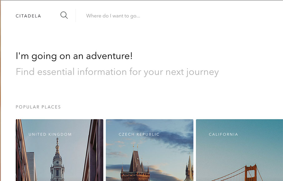
Super simple and probably as minimal as it can get for a site like this. I love the simple placement of the location images and how you can just keep sliding to the right to see more. The search design is pretty sweet too.
Glassmorphism: The Transparent Design Trend That Refuses to Fade
Glassmorphism brings transparency, depth, and light back into modern UI. Learn how this “frosted glass” design trend enhances hierarchy, focus, and atmosphere, plus how to implement it in CSS responsibly.


0 Comments