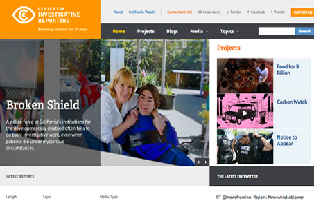
I love the large orange shape to the left of the page in the background. It reminds me of the golden ratio a little bit when you put that together with the other elements on the page. The smaller iPhone screen size of this responsive implementation is pretty good. Some of the navigation gets pretty small and doesn’t feel like it would be the easiest to select but overall it’s pretty dang spiffy.
Glassmorphism: The Transparent Design Trend That Refuses to Fade
Glassmorphism brings transparency, depth, and light back into modern UI. Learn how this “frosted glass” design trend enhances hierarchy, focus, and atmosphere, plus how to implement it in CSS responsibly.


0 Comments