
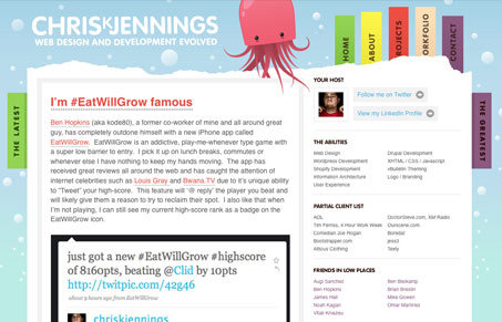
Really clever & simple layout on this site, there’s nothing over the top about this design and that’s why I like it so much. The header illustration is intriguing enough to make me look a little deeper. He also has one of the creepiest yet funny 404 pages i’ve seen.


Fitts’s Law: Why the Easy Button Wins
Large, close targets are faster to hit than small, distant ones, that’s Fitts’s Law. A look at the 1954 rule behind buttons, prime and magic pixels, thumb zones, and dark patterns.


nice design. yea.
terrifically creative
Wonderful design, i love it…