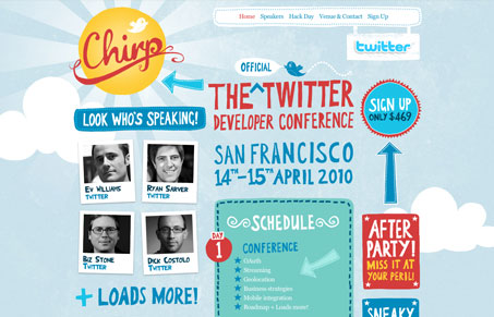
This is a wonderfully playful conference website, you’d expect it to be something pretty awesome looking for twitter’s first conference like this and the guys at Carsonified deliver. The thing I like about it is that while it’s really playful it’s not over the top, there’s no crazy interactive animations and whiz bangery, it’s just great illustration supporting a clear account of information. The illustration of the San Francisco skyline in the footer is just beautifully done. The colors and hand made feel of all the elements on the site make it feel accessible even though this conference really isn’t when you consider the amount of tickets they are releasing and the overall size and interest level in the twitter developer community.
Each page has been carefully worked out to both fit in with the rest of the site but give an independent account of the content that it has to present, the best example of this is the “hack day” page which takes you to a night time rendition of the other pages (given that it’s a 24 hour hack-a-thon it’s promoting.)
I really like this website. While I don’t think it changes the way we are going to design websites or anything grandiose like that, I do think we can learn a lot about what works and what makes a website memorable by investigating this project. It’s simple execution with good copy that has character and illustration that matches that character and quality that drive this design home. I’ll be referring to it myself as an example of great design when talking to my own clients i’m sure.


0 Comments