Submitted by Josiah Roe @josiahq.
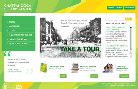
It has three different color schemes, a different one on each session, it’s pretty cool.
I really like the look of this website. The colors are unique and the typography is quite sharp, mix that in with some nice photography and it’s a winner. If there’s something to criticize here, i’d say that it needs to give the user some more feedback on the links, the main nav has a roll over state but the other elements that are actual buttons and other text links don’t change in any way. That would really complete this site in a nice way. I also really enjoyed the background image, it gives the page a nice sense of movement and aides the movement of your page scanning back up to the top right corner where “become a member” and “contact us” are, i’d suggest really thinking over that particular place on the page and make sure that the absolute most important links are there.


One of the biggest background images I´ve ever seen on a website so far, but the size is just about 113kb.
X-)
113kb is quite large (although I’ve seen far bigger) but probably not a problem for the majority of users.
The background really helps anyway… lovely website.
The backgrounds change on session. Red, Blue and Green.
It’s not the size, it’s how you use it folks.
Nice comments here. To address the size issue, the background needs to be that large to accommodate large screens, obviously. I would agree with the rollover states for the buttons. Good suggestion there.