
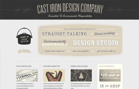
Really great vibe here with the slight textures and typographic choices. I love the colors and how it ties in so seamlessly with the look and feel of the prints and other work they have to offer. I like the main navigation being off kilter like that too, once you discover it you really relish it’s design. Lots of other little well designed details across this site too.




0 Comments