
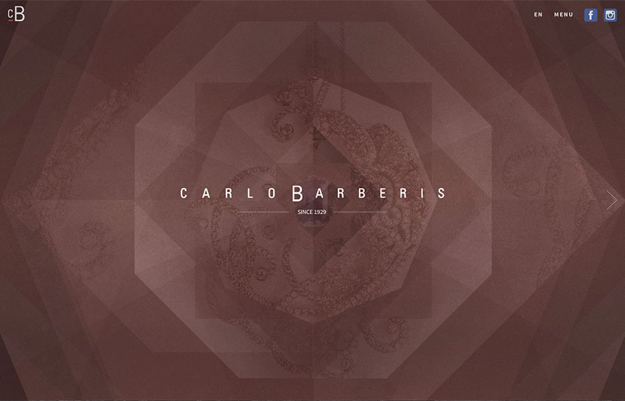
This is a great showcase site for Carlo Barberis’ jewelry collection, out of Italy. Love how the home page is just a scroll slider, but before you start, the changing of the overlaying patterns already give movement and life to the page. Also think the off-screen navigation (click “Menu”) is outstanding, with simplicity, and it frames the the branding – smart and clean.


Fitts’s Law: Why the Easy Button Wins
Large, close targets are faster to hit than small, distant ones, that’s Fitts’s Law. A look at the 1954 rule behind buttons, prime and magic pixels, thumb zones, and dark patterns.


0 Comments