carbonica.org

carbonicaorg

carbonica.org

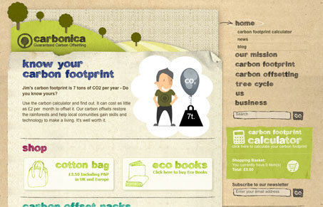
I’m loving the earthy textures, fun colors, illustrations and hand-drawn looking font. There are two tiny tweaks that I would suggest to make this site really great: make the background repeat smoother and use an image replacement on the nav rollover (so they don’t temporarily disappear).

Also, they have a lot of good information on the subpages but it might help skimming to put some subheads in there or section it out better – since it’s so much.

0 Comments

Submit a Comment

Your email address will not be published. Required fields are marked *

Time limit exceeded. Please complete the captcha once again.

News & Articles

Website Scanning Patterns for Maximum Engagement

Website Scanning Patterns for Maximum Engagement

Discover how users visually process websites, the role of scanning patterns, content placement, and “the fold” Learn to design engaging pages with fast-to-consume content that aligns with user behavior.